When you’re building a Drupal website that is responsive, it’s vital that the main menu is responsive as well. Users will have a tough time navigating your website if the menu hasn’t been optimised for mobile devices. You don’t have the luxury of a mouse cursor when you’re on a mobile or tablet device, instead you navigate by using touch.
So what solutions are out there for Drupal sites?
Well first, check if your Drupal theme offers responsive menus. A few of the popular base themes support them out of the box, if the theme you’re using doesn’t, then take a look at the Responsive Menus module.
UPDATE: The 7.x-1.x-dev branch ships with three styles.
The module offers two responsive menu styles:
First, “Simple 3-bar expanding”:
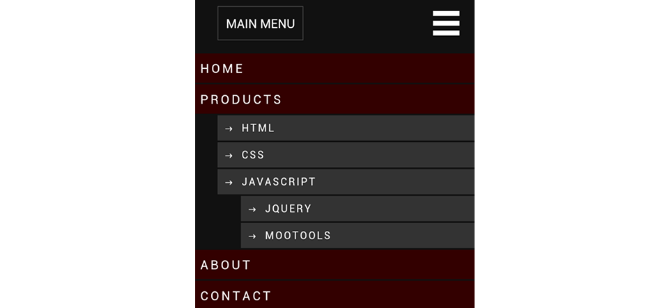
And, “Mean Menu”:
The “Simple 3-bar expanding” is the easiest to setup. The “Mean Menu” style, on the other hand is fancier but it requires jQuery 1.7+ and this means you’ll have to install jQuery Update.
In this tutorial, we’ll look at how to setup both styles using the Omega theme. Make sure you use a responsive theme and not the default Bartik, because the menus won’t become responsive.
Getting Started
Before we begin, go download Responsive Menus, jQuery Update and Omega.
If you use Drush, run the following command:
drush dl responsive_menus jquery_update omega
Once you’ve downloaded everything, for now, just install the Responsive Menus module and enable Omega’s Ohm demonstration subtheme.
How to Setup Simple 3-bar Expanding Menu
Now that we have everything installed, let’s go to the module’s configuration page and configure the “Simple 3-bar expanding” style.
1. First, go to Configuration -> “Responsive Menus”.
2. The most important option on this page is the CSS/jQuery selector. We need to let the module know about the menu and we do this by adding a jQuery selector into the “Selectors for which menus to responsify” text-area.
There is a good chance that the default .main-menu will not work because every theme defines block and menu elements differently. So all you need to do is find the main wrapping element for your menu.
Because I’m using Omega, I’ll add #block-system-main-menu into the selector text-area.
Now if I go to the homepage and resize the browser, the menu should change to become responsive. To view the menu all you have to do is click on the “Menu” link.
How to Setup Mean Menu
As stated earlier, the module ships with two responsive menu styles: “Simple 3-bar expanding” and “Mean menu”. Now let’s learn how to configure and use the “Mean menu” style. But before we can use it we need to make sure Drupal is using jQuery 1.7 or higher.
1. First, download and install jQuery Update.
2. Then go to Configuration -> “jQuery update” and select 1.7 from the “jQuery Version” drop-down list and click on “Save configuration”.
Warning: After you’ve configured jQuery update, make sure you test the whole site and look out for any JavaScript errors, do NOT assume everything will just work. Drupal 7 officially supports jQuery 1.4.4 and if you’re using a lot of contributed modules, you may find a few are not compatible with newer versions of jQuery.
3. Now, go to Configuration -> “Responsive Menus” and select “Mean Menu” from the “Responsive menu style” drop-down list.
4. Enter in the class name or id of the wrapping element into the “CSS selectors for which menu to responsify” text field.
I’ll enter in #block-system-main-menu but remember your selector may be different.
5. Scroll to the bottom and click on “Save configuration”.
6. Now if you go to the homepage and resize the browser, you should see the “Mean Menu” style at the top.
Conflict with Contextual Links
UPDATE: This issue has been fixed in the 7.x-1.x-dev branch.
Now, you may have problems using this style because the contextual links will be picked up as the menu instead of the actual main menu. The simplest solution to this problem is to disable the Contextual Links module.
Bonus: Omega’s Off Canvas Layout
Throughout this tutorial I’ve been using the brand new Omega 4.0 theme and one thing I want to demonstrate is the “Off Canvas” layout.
This layout offers responsive navigation out of the box.
If you’re planning on using Omega 4 as your base theme, then take a look at the “Off Canvas” layout.
Conclusion
The reason why I like the “Responsive Menus” module is because it’s very easy to setup on any existing Drupal website. You don’t have to make drastic changes to your site like using a new base theme or reimplementing the main menu block. Just set the right CSS/JS selector and you’re good to go.